PS Studio Communications — Brand System
ENERGROUP Brand Guidelines
The working reference for the ENERGROUP identity: how the master brand and its two divisions are drawn, coloured, set in type and applied across digital surfaces. Built alongside energroup.eu so the guidelines and the live site never drift apart.
Positioning
ENERGROUP is a Cyprus energy group, not a panel installer. The identity has to hold an engineering-grade parent brand and two specialised divisions without fragmenting.
Confident, not loud
Amber is a signal, not a wash. It marks the one thing that matters in a view — a CTA, a figure, a step number.
Engineered, not corporate
Tight geometry, generous negative space, hard alignment. No stock gradients, no soft-focus sustainability clichés.
One group, three marks
ENERGROUP leads. ENERtrust and ENERcore inherit the same wordmark construction and differ only by accent colour.
Logo suite
Linear lockups are the default across all digital applications. The logomark is reserved for avatars, favicons and spaces narrower than 120px.


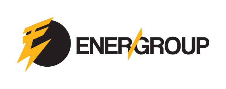
Clear space on all sides equals the height of the “E” in the wordmark.
Minimum width: 120px on screen for the linear lockup.
White lockup on Graphite or True Black; black lockup on Paper or Mist.
Place over imagery only where an overlay keeps contrast at 4.5:1 or better.
Never recolour, outline, rotate, stretch or add effects to the mark.
Never lock the division marks beside the master mark as a single unit.
Colour
Two light surfaces and two dark surfaces alternate down every page. Accent colours carry meaning — they are never decorative.
#FDB518Primary brand colour. CTAs, numerals, highlights, iconography.#D99A0CHover and pressed states only. Never as a fill for large areas.#1E1E1EPrimary dark surface and body text on light backgrounds.#000000Alternating dark surface, video overlays, footer.#4670B7ENERtrust division accent. Never on the master brand.#8650A0ENERcore division accent. Never on the master brand.#EFEDEDLight section surface, icon fills, dividers on white.#FFFFFFPrimary light surface. Alternates with Graphite down the page.Typography
Coolvetica sets every heading in uppercase. Eurostile carries all body copy, labels and form fields. Nothing else ships to production.
Νέα Ισχύς
ABCDEFGHIJKLMNOPQRSTUVWXYZ 0123456789 ΑΒΓΔΕΖΗΘΙΚΛΜΝΞΟΠΡΣΤΥΦΧΨΩ
Net Billing
Photovoltaic systems, batteries and maintenance across Cyprus.
abcdefghijklmnopqrstuvwxyz αβγδεζηθικλμνξοπρστυφχψω 0123456789
| Token | Value | Use |
|---|---|---|
--fs-hero | clamp(44px, 6.2vw, 94px) | Hero statement, one per page |
--fs-h1 | clamp(34px, 4.4vw, 64px) | Page title |
--fs-h2 | clamp(30px, 3.4vw, 51px) | Section heading |
--fs-h3 | clamp(24px, 2.1vw, 34px) | Sub-section |
--fs-h4 | clamp(20px, 1.5vw, 24px) | Card title |
--fs-body-lg | clamp(17px, 1.25vw, 20px) | Lead paragraph |
--fs-body | 17px | Body copy, min size on all breakpoints |
Components & layout
Spacing runs on an 8px base (8 / 16 / 24 / 40 / 64 / 96). Container is 1280px with an 80px gutter, dropping to 24px under 1024px.
Buttons
Pill radius 60px, uppercase Coolvetica, 14/28 padding. One amber button per view; everything else is the ghost variant.
Cards & radii
8px for inputs and chips, 12px for cards and media. Borders sit at 12% white on dark, 10% black on light.
Motion
200ms with cubic-bezier(0.22, 1, 0.36, 1). Reveals move 16px maximum. Every motion respects prefers-reduced-motion.
Accessibility
Body text never below 17px. Contrast holds AA on all surfaces; amber is used on dark or as a fill behind Graphite text, never as light text on white.
Imagery
Real installations and Cyprus rooftops. Dark overlay gradient on any photo or video carrying text.
Voice
Direct and technical in both languages. Greek copy uses industry terminology as used in Cyprus; the tagline is fixed and never translated.
Full brand document
The complete brand bible as delivered, for print specifications and off-screen applications.